Tag Archive for: Design

KRNA 94.1 Iowanarock

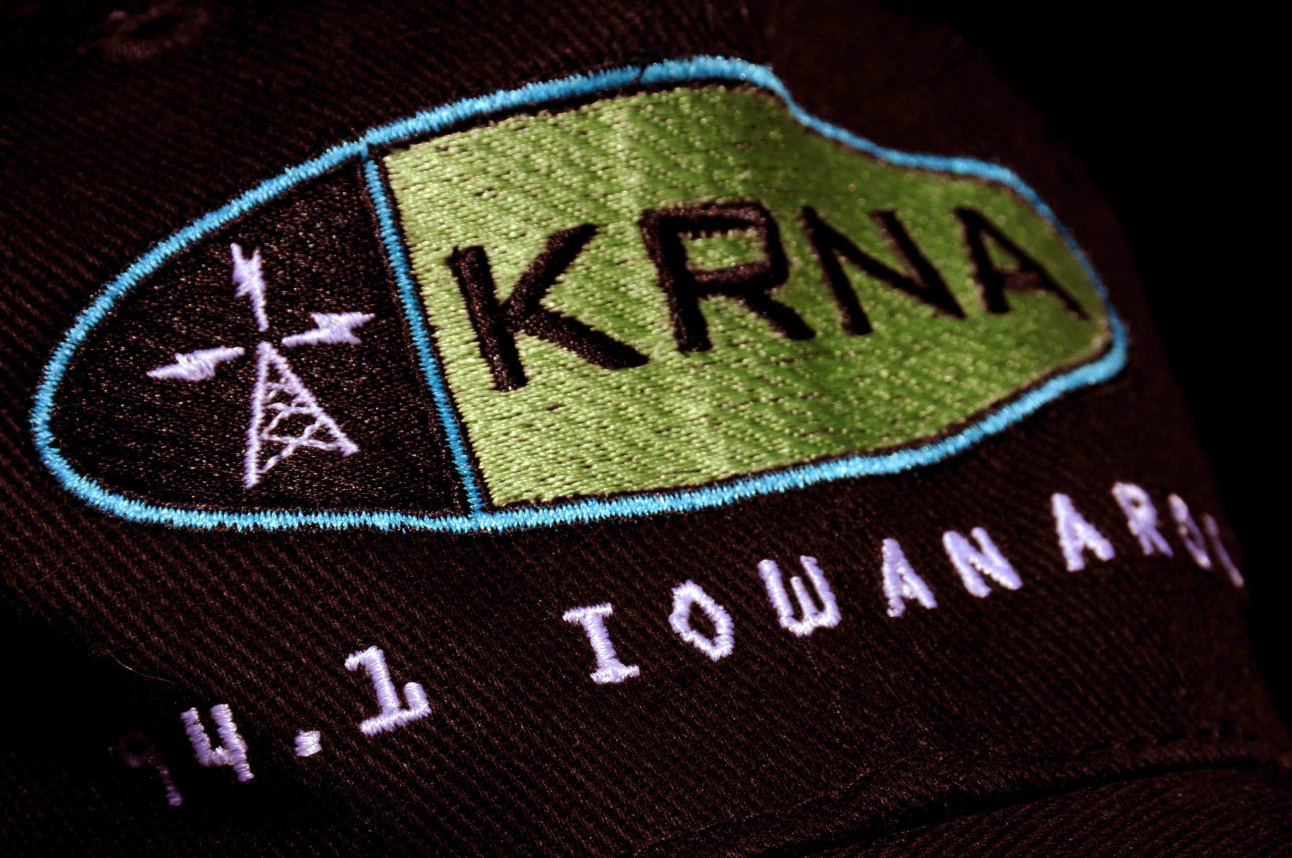
A number of years ago we designed everything for legendary classic rock station 94.1 KRNA. Founded by a couple of University of Iowa students, Rob Norton and Eliot Keller, KRNA grew from grassroots-to-powerhouse.

Rob and Eliot sold off their lifelong project in 1998. Prior to them doing so, we kicked off a new look for KRNA, with a new logo and positioning line. In a sea of tired rock station taglines, we wanted to create something fresh, maybe even a bit odd and definitely regional.

The result? KRNA. 94.1 IOWANAROCK.

Our involvement with quarterly magazine, The Brass Bell, caught the attention of a Boca Raton, Florida-based client interested in establishing an upscale lifestyle magazine for the Lake Geneva, Wisconsin area. This was a great opportunity—the chance to establish a vertical, niche publication for a legendary tourist destination.

For those not familiar with Lake Geneva, this small community on a lake is nestled just north of Chicago, and just west of Milwaukee in southeastern Wisconsin. The area has more interesting history than any small Wisconsin town should have—the playground of the Schwinn’s, the Maytag’s, the Wrigley’s, and yes, Guns ‘N Roses lead singer Axl Rose. Hugh Heffner even established one of his legendary Playboy Clubs in Lake Geneva.

The first issue of G is the result of many hours of interviews, sweat, and mental gymnastics. It’s not the easiest task assembling a magazine from vapor, but given G’s overwhelming debut, I think we hit the mark.

G Magazine Masthead Script

Van Ness Engineering

I have known David Van Ness of Van Ness Engineering for many years now. He is very well-known in the antique boat niche, and has a reputation for being among the best engine restorers in the business. David has worked on a few projects for me, and I have worked on a few things for him. Recently we were asked to take a new look at his advertising and marketing communications with the goal of creating a presence given today’s dynamics within this small niche.

Here is a look at the first creative in this ad new series. The concept focuses on several types of enthusiasts:

  • Those interested in totally rebuilt internals with museum-grade external restoration for Concours-level competition.
  • Those interested in a partial rebuild with good (but not necessarily Concours-level) exterior cosmetics.
  • And those interested in building an ultra-reliable vintage motor, with little regard to exterior detailing.

This is a very straightforward concept executed in a very clean style. There are several other ads in the series that we will show soon.

Van Ness Engineering Ad

Z102.9 Mac Bus Detail

Barbie, you’ve had your time. And after three years on the road—through rain, sleet, snow, sand, and salt, —frankly, you’re looking a bit haggard. Your time has come. Go freshen up, and let a new day begin.

Good morning starshine, the earth says hello
you twinkle above us, we twinkle below
good morning starshine, you lead us along
my love and me as we sing our
early morning singing song

gliddy glub gloopy nibby nabby noopy
la la la – lo lo
sabba sibbi sabba nooby aba naba
lee lee – lo lo
tooby ooby wala
nooby aba naba
early morning singing song

The new Z Bus is truly unrestrained. This concept started out as a “green and outdoorsy” kind of theme. It eventually became kind of a dare between designers.

“I’ll bet you won’t put a happy face on the clouds.”
“Oh yea, I will, and I’ll even put in a volcano.”
“No way. How about an undersea world? Bet, you’d never do that.”
“Oh, I will for sure. And how about some toadstools?”
“Toadstools? Are you kidding me? Well, if you’re gonna do that, you might as well throw in a unicorn…”

Z102.9 Magic Bus

Z102.9 Logo

How do you promote Z102.9 to a University of Iowa, music download inclined/payment averse student population? This ad was specifically concepted for this tough crowd, and was featured in the U of I’s student newspaper, The Daily Iowan. The concept for this ad, hit students right where they live—in the world of free music, and wireless connectivity. This ad also ran about the time the Record Industry Association of America (RIAA) was clamping down on illegal music downloads. Given this, a healthy dose of paranoia drove the ad home.

Z102.9 Daily Iowan Ad

Rock Z on HD3

A lot has changed in radio over the last few years. Z has been a pioneer since the station’s conception. HD Radio is one such example. I won’t attempt to explain HD radio here. I would look like a poser and the true audio geeks would rain down on my misuse of all the esoterica. From an end user perspective, HD radio is pretty cool. A frequency, such as 102.9 (through the miracles of modern science) can be split into a number of multicast channels.

Early on, as Z experimented with how to split the frequency into several multicasts, Basler Design Group was, at the same time, experimenting with how to “split” the Z identity into three sub brands. This seems easy on the surface, but it is actually quite challenging. The mother brand Z102.9 had legs, with great awareness. And this awareness was directly tied back to a station format (Contemporary Hit Radio), which in turn attracted a specific listener. Now, under the new HD multicast structure, Z102.9, the Contemporary Hit Radio (CHR) format is now 102.9 HD1. 102.9 HD2 could be an entirely different format, such as Classic Rock, and attract an entirely different listener. And, likewise, 102.9 HD3 could be a third format with a third listening demographic.

Whew. This is a real challenge. The examples below were experiments in this brand extension exercise. To date, these have not been used, but they are pretty interesting given this branding puzzle.


Hit Z on HD1

Club Z on HD2

Club Z on HD2

Rock Z on HD3

Z102.9 Media Kit

Our relationship with Rob Norton at Z102.9 goes back some 18 years. “But Z102.9 has only been on the air for 12 years,” you say? Well, this is true. Rob’s relationship with Basler Design Group goes back to about 1992, when he, and partner Eliot Keller, owned another iconic Rock radio station, KRNA, based in Iowa City, Iowa. We collaborated on many projects for KRNA, as well as Q103, the predecessor to Z102.9.

This is an overview brochure that Z102.9 advertising sales staff would use to promote the station to potential advertisers. This piece was designed to have the simplicity of a flip-chart—simple compelling statements, presented with memorable imagery.

Z102.9 Media Kit Spread
Go ahead. Click on it. There’s so much more to see.

For all of you graphic design history buffs out there, this piece was executed with Quark Xpress 3.3, Photoshop 3.0 aka Big Electric Cat. It seems like a lifetime ago, but, conceptually, this piece has stood the test of time very well.

Z102.9 KZIA

In just a few short years, a logo of ours has reached iconic status. Basler Design Group has had a long time relationship with Rob Norton, owner of Contemporary Hit Radio station, Z 102.9.

Let it be known—Rob is a character. He has a personality all his own, but if you can solve the puzzle, you’ll find a brilliant marketing mind. Our business relationship goes back 18 years, so I think we’re getting along well. And based on the work we have done together, the partnership seems to be working.

Known formally as Z102.9, (KZIA if you pay attention to FM radio call letters), this powerhouse of a radio station is known today as—simply—Z.

The design objective with the Z identity was to create a mark that was incredibly versatile and clean. Somewhere along the way, the principles behind a color blindness test made its way into the logo color palette. Yellow, yellow with a tinge of orange, and yellow with a tinge of green. These three colors are combined in such a manner that makes one’s eyes vibrate with glee.

We have 18 years of KZIA work to show. We’ll start with a simple statement—Z.

Z102.9 Logo

Amana Heating & Cooling Shipping Carton

From about 1991 to 2002, Basler Design Group had the pleasure working with several great people at Amana Refrigeration. We did some great work, moved the brand ahead, and had a lot of fun in the process. One such character was Dennis McNeil. Dennis was a new hire in the Heating & Cooling area. As the son of a HVAC man, I guess his career path was defined in his genes.

I still remember those days very well. Our work was refreshing, especially given the somewhat industrial nature of the niche. A problem with most Heating & Cooling contractors is that few have a showroom. After all, why would you? Air conditioners and furnaces are heavy, and not all that interesting to look at.

After a bit of thinking it dawned on us, that a furnace/air conditioner shipping carton was a missed branding opportunity. Hey, the cartons have to be present. And they’re darn big. It seemed like a waste to not put a little ink on them and make them work a bit harder. Of course, all of the accountants were cringing at adding any cost to the printing of cartons, so we designed the artwork to be implemented in one color—black.

Hauled to residential neighborhoods in the back of pickup trucks, the brown kraft cartons were immediately recognizable, and added little cost to the bottom line. Score one for commando marketing.

Amana Heating & Cooling