Smart FM Radio Logo

This Smart FM Radio Logo marks the sixth radio station identity that we have done to date. You can listen to Smart FM radio online here, or at 95.1 Cedar Rapids, 98.5 in Iowa City on your tried and true FM receiver.

Our brainstorming discussions for this new identity referenced 1960s underground radio station, KAAY out of Little Rock, Arkansas—and specifically their night time program, Beaker Street with Clyde Clifford which had a very unproduced, underground feel with low-fidelity cosmic sound effects and other oddities.

Through the marvels of AM radio evening hour transmission, KAAY’s signal reached Iowa City, Iowa on many evenings, becoming a favorite of eastern Iowa listeners.

Smart FM’s logo features a custom designed type font and a cosmic 1960s sci-fi-ish antenna. The logo should feel a bit vintage—and a bit odd—but fresh at the same time. Is that even possible? #baslerdesign #smartfm #smartrockin #radio #logo #graphicdesign #oddisgood
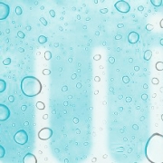
What a great name. We have been called on to develop an identity based on this one, simple word. We can’t exactly disclose the who, what, where of this project just yet. Rest assured, we will reveal the details of this company very soon. Until then, here is a first look at fluid.

Fluid has a positive vibe. Free-flowing. Continuous. Without beginning or end. Without boundaries. Our solution is a handcrafted script for the fluid word mark. To keep the graphic simple, we constrained our solution to a couple of rules:

  • One single line…as though it was drawn without lifting pen from paper.
  • One line weight.

We’re pleased with the result. It looks right. And perhaps more important, it feels right.

fluid

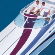
I love upstarts. They offer all sorts of unique opportunities and challenges. This upstart, Offshore Concepts, came to Basler Design Group because of our experience in the boat building niche—especially given our experience with smaller volume, regional builders who put craftsmanship at the top of the priority list.
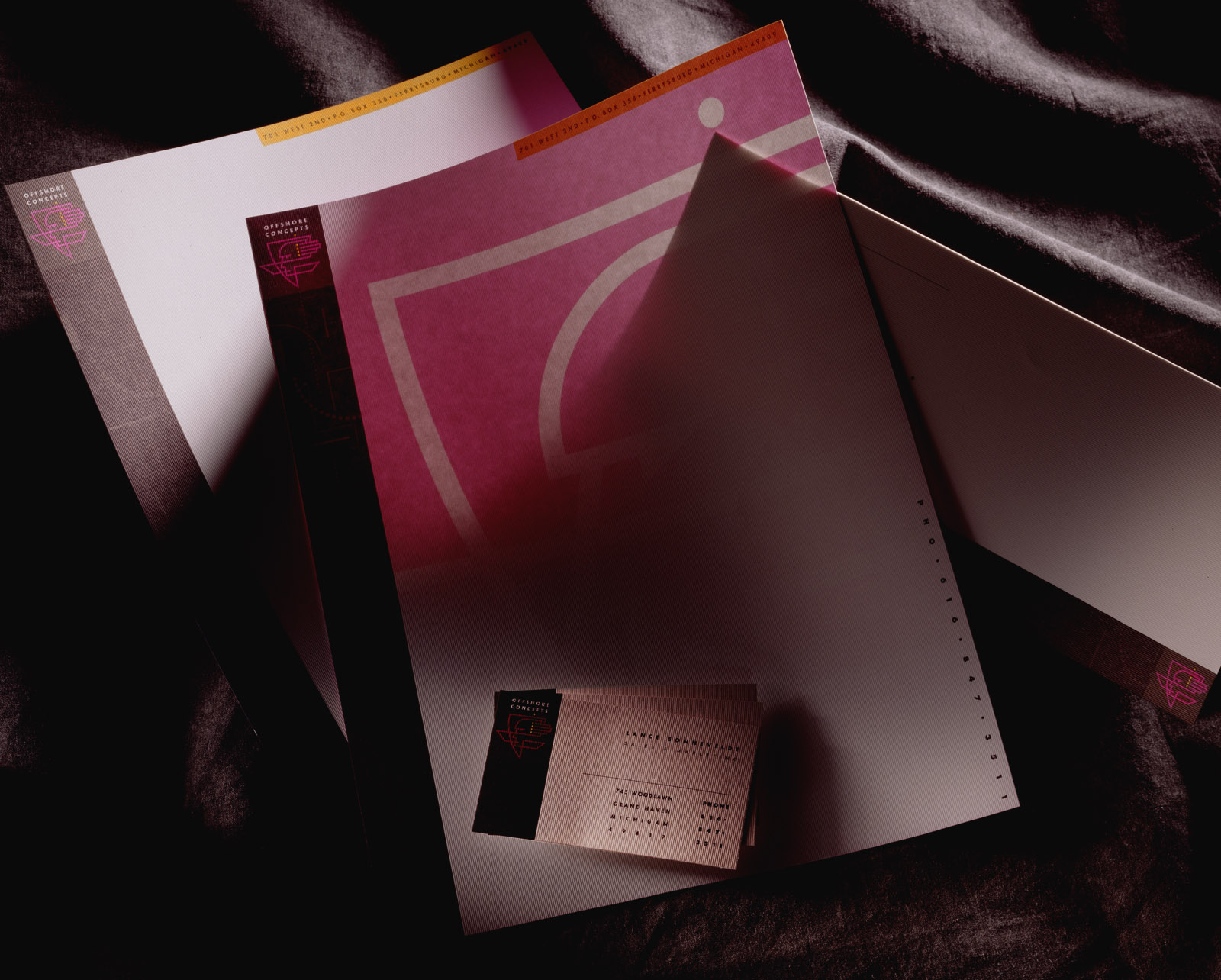
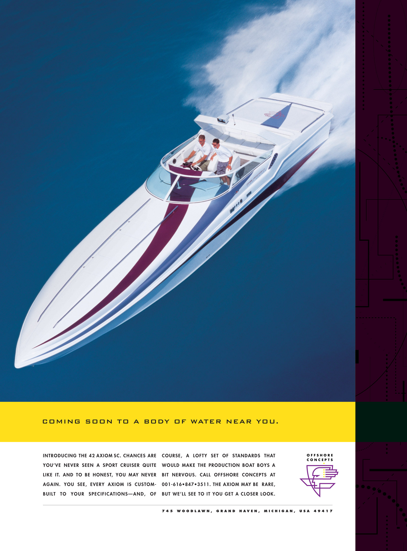
Typically companies like Offshore Concepts are less concerned about making their first million than they are in producing the best product around, and getting their first couple of orders.

Basler Design Group created a very unique identity, getting Offshore Concepts off to a fast start. The letterhead incorporated an innovative two-sided approach. A large version of the Offshore Concepts “shield” was printed in a very intense magenta ink on the back side of the letterhead sheet. The shield was sized in such a manner that it perfectly aligned with front-side artwork and also fold lines and margins. The super-sized shield graphic shows through the paper, creating a ghosted image on the front side.

After the basic identity components were in place, we proceeded to the design of print ads and brochures.

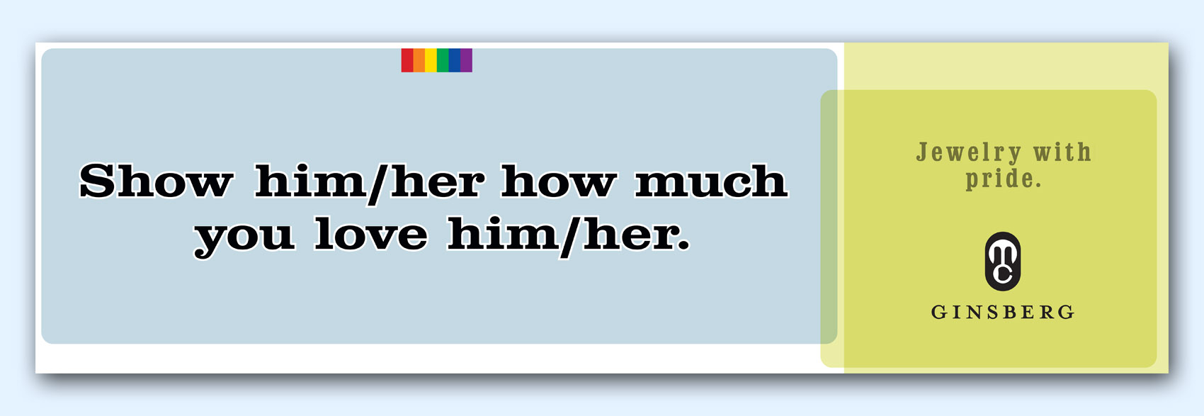
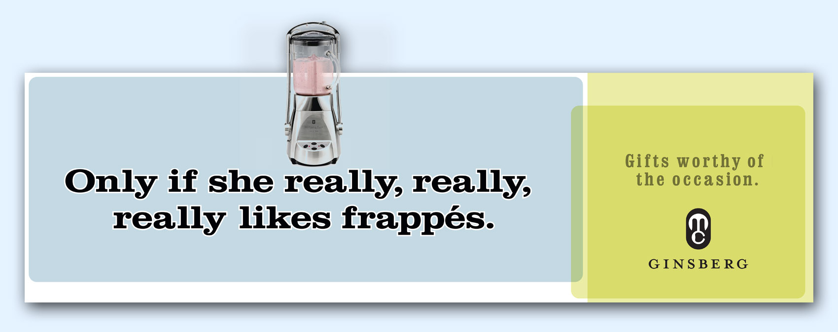
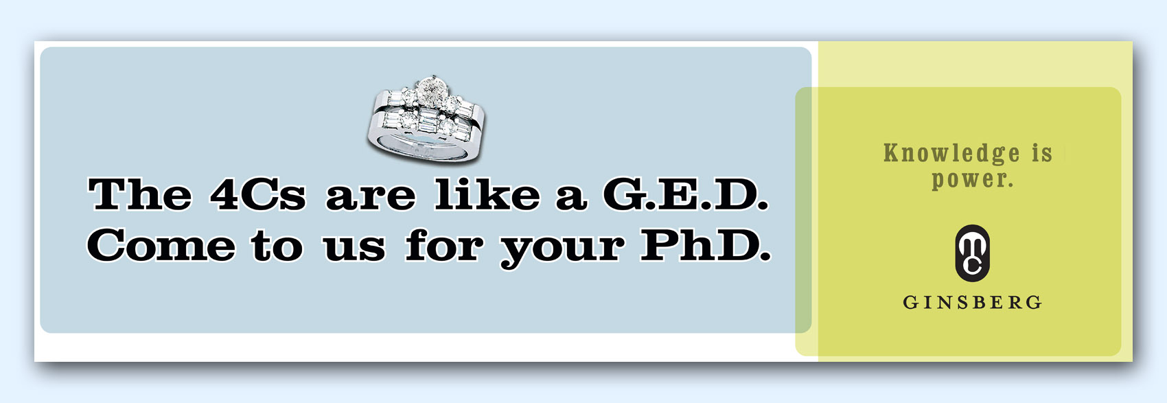
Basler Design Group was hired to create a new visual branding program for regional jeweler, M.C. Ginsberg. We started small but quickly progressed to the big stuff—outdoor board big. Here are a few of our concepts.

Great outdoor is not easy—but we love the challenge. These boards were written by good friend, Chris Lien. The visual elements are light and transparent, emulating the feel of looking through a gemstone. The MC ligature gives the logotype a very monogram-like element. The ligature was supported by the Ginsberg name—well-known amongst regional jewelers.

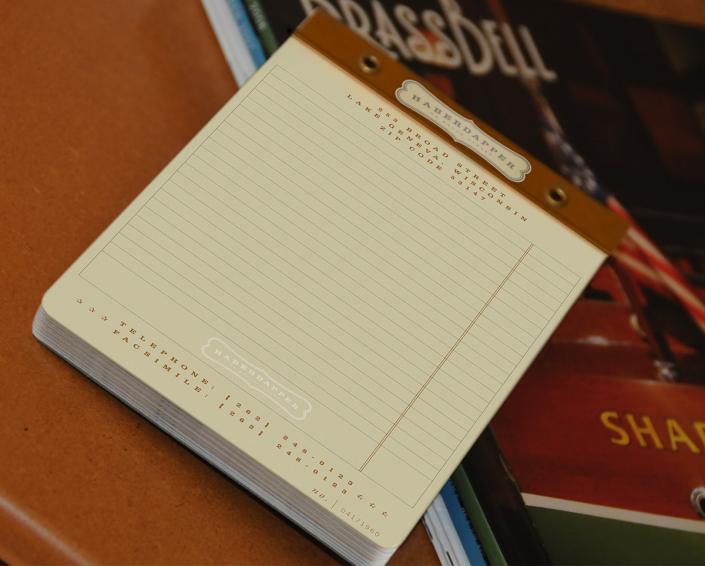
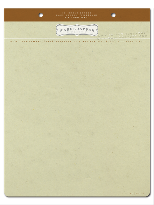
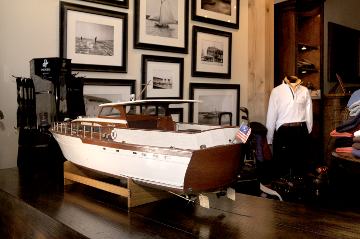
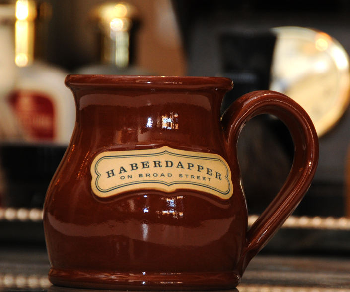
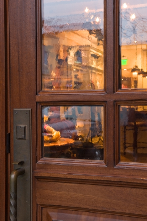
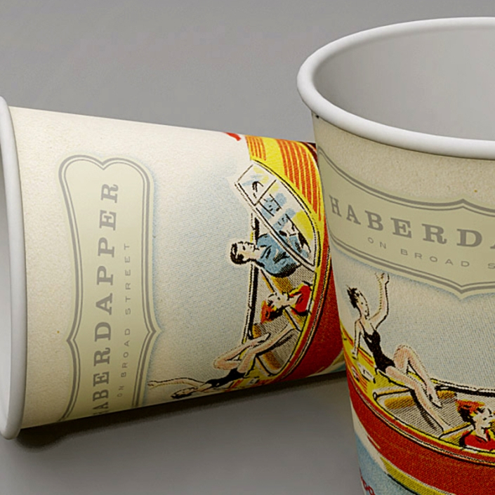
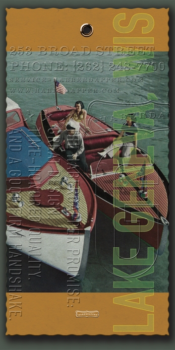
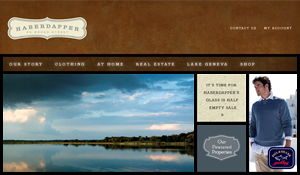
For about the last year or so, we have been working with Haberdapper, a men’s clothing store in Lake Geneva, Wisconsin. Basler Design Group developed Haberdapper’s identity program, signage, store interior and point-of-sale needs, as well as email marketing and advertising components. We have quite a lot of work to show for Haberdapper. We’ll start by showing a few of the basic identity components.

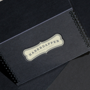
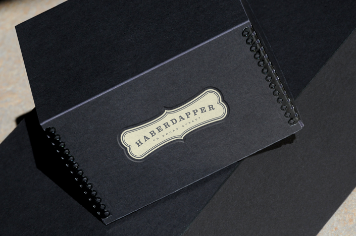
The Haberdapper wordmark was given a vintage retail flair by way of its “Milk Bone” dog biscuit background shape. A color palette of dirty orange, cream, and cool gray rounded out the look.

Haberdapper on Broadstreet Logo

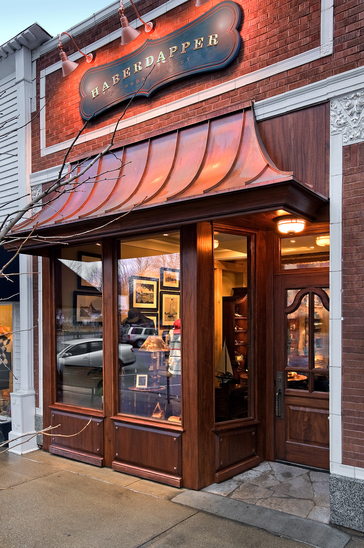
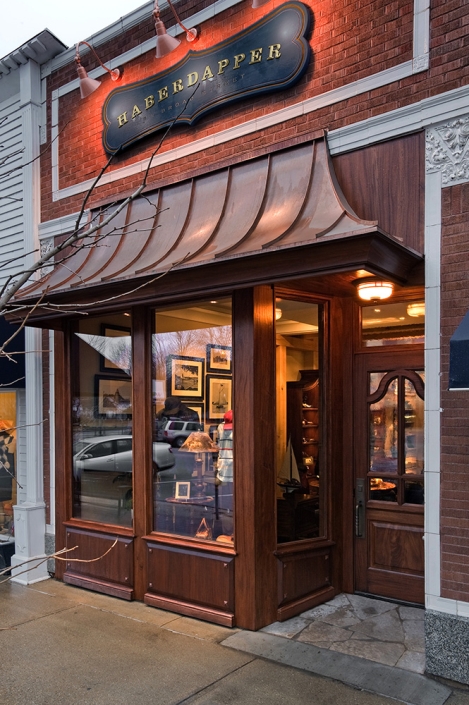
The storefront sign was designed within the strict parameters of historic Lake Geneva’s building and sign ordinance. The sign was designed to fit within a 2-foot x 8-foot space, with a maximum area of 16 square-feet. The solution was to manufacture a painted and aged wooden sign with gold leafed letterforms. While newly manufactured, the sign looks as though its been hung for years. The background was distressed, using cracked paint, rubbing, and glazing techniques. The Haberdapper letterforms are dimensionally carved and guilded with real gold leaf.

The goal was to create an identity that looks like it could have been in place 75 years ago. We love using manufacturing techniques that the machine age offers, but finishing the artwork with “elbow grease” patina.