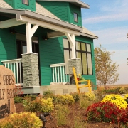
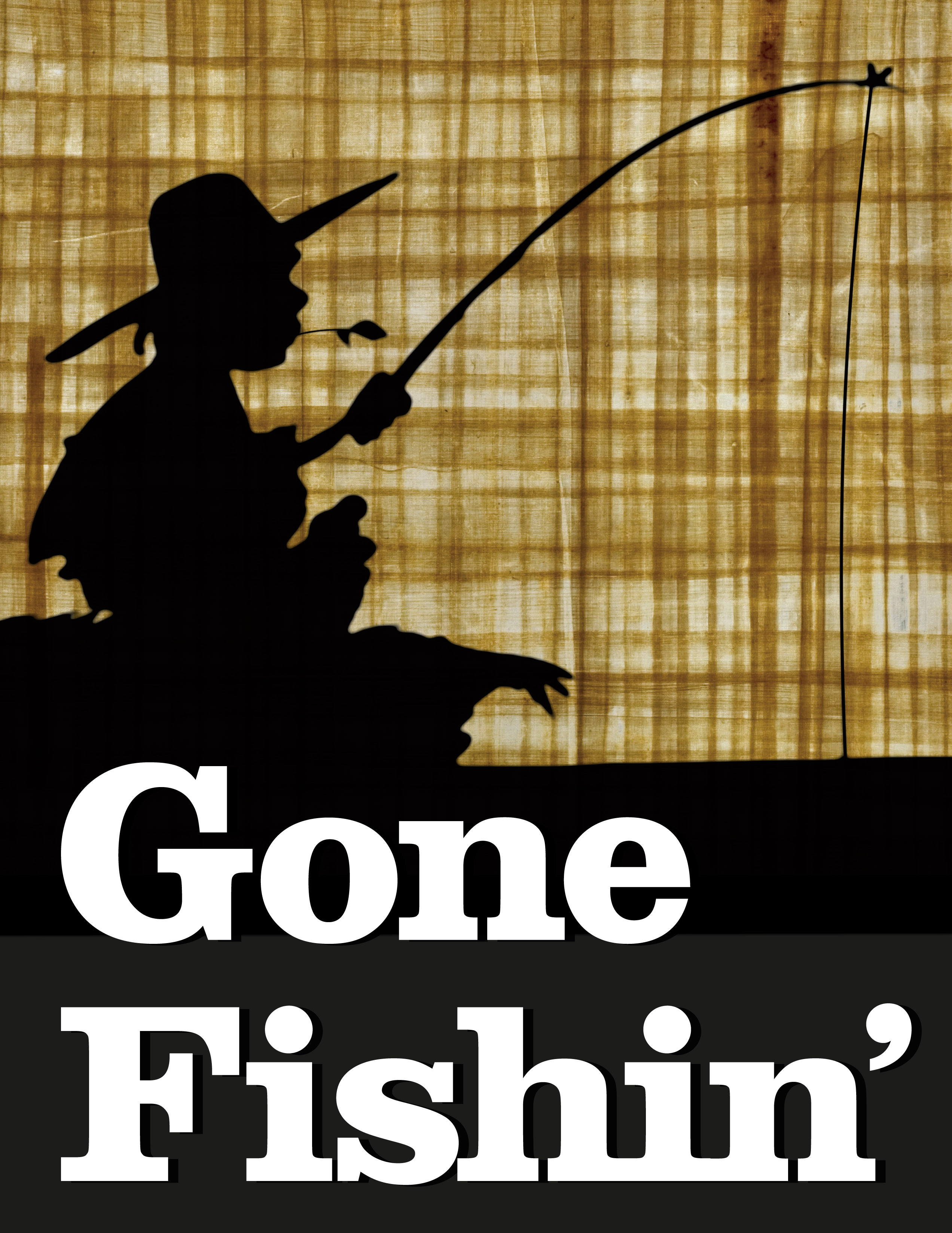
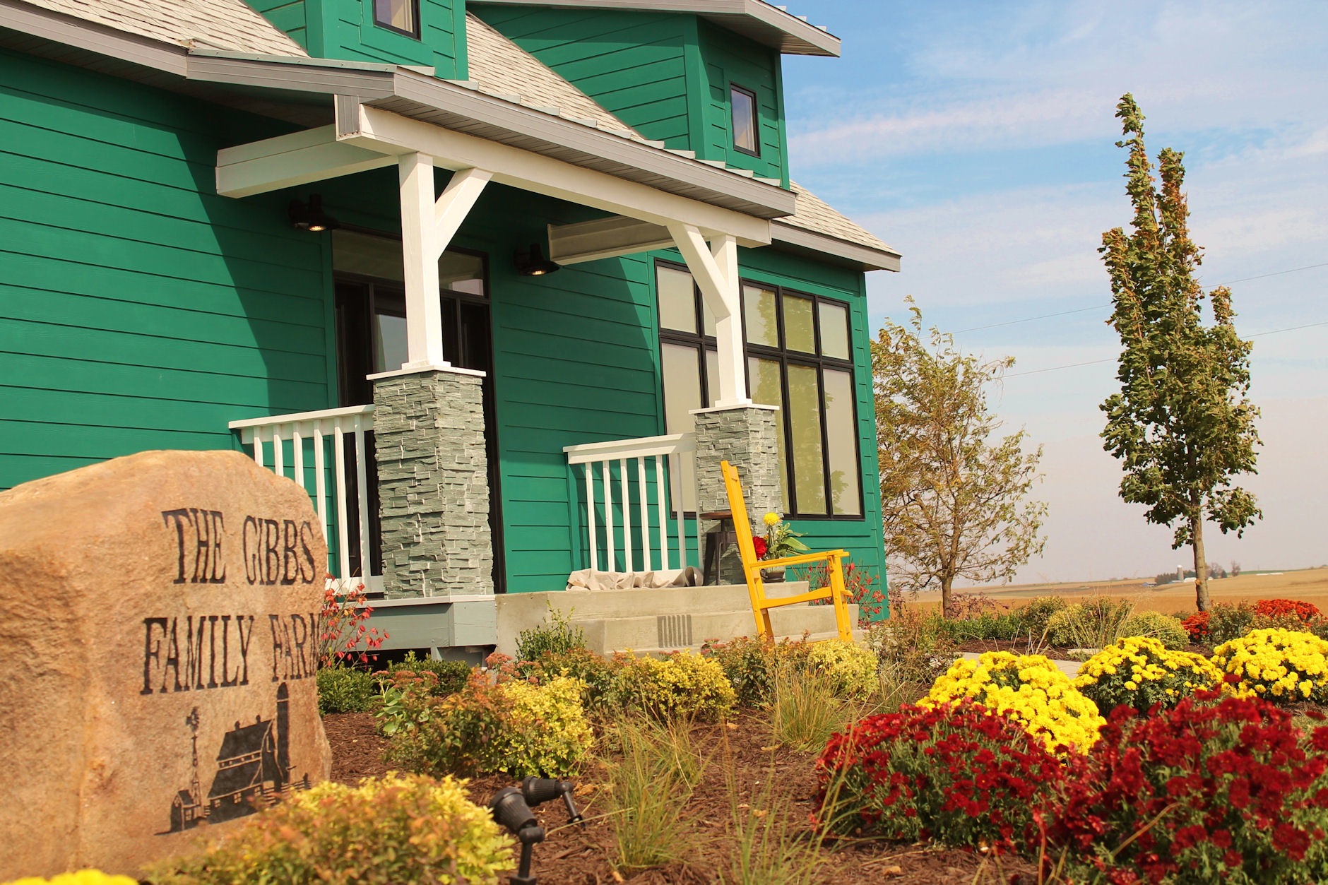
The word is out and I have the all-clear from ABC TV to talk freely about my involvement in the Extreme Makeover Home Edition, Gibbs family home in West Union, Iowa. It’s not everyday that Hollywood comes to Iowa—so that alone made this a pretty big deal. Better yet, this was an opportunity to help a family in need—making this a great project all the way around.

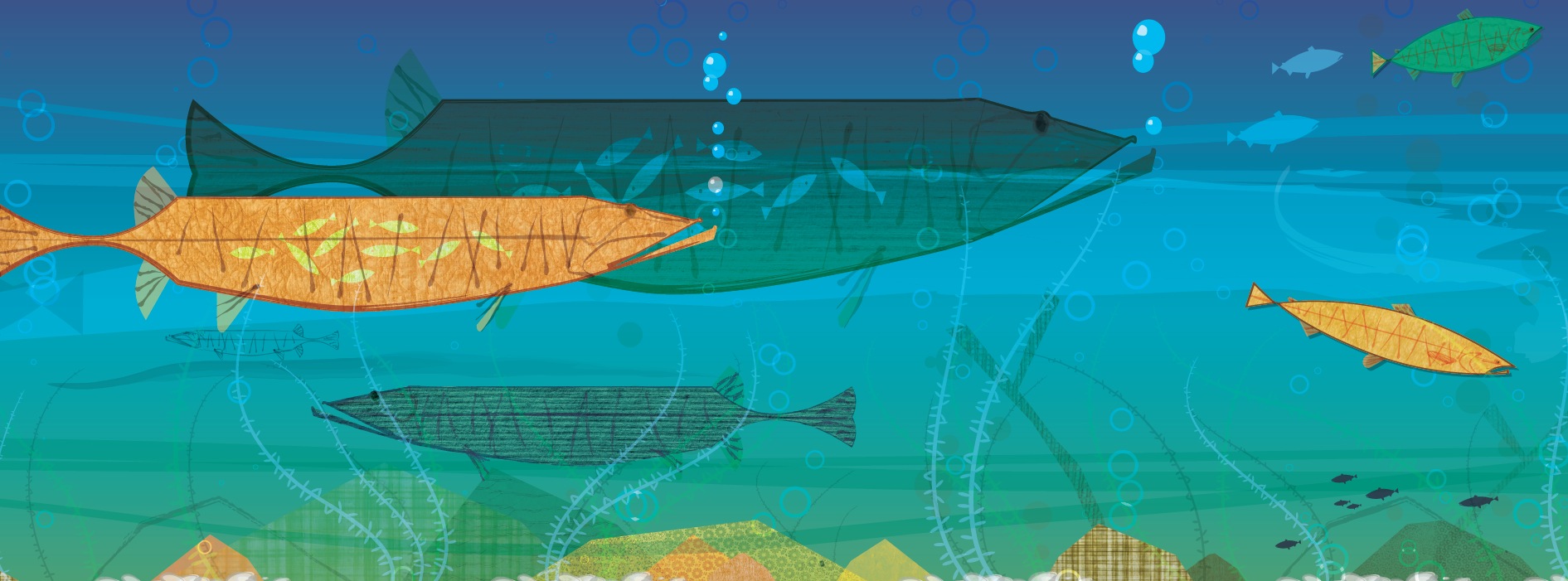
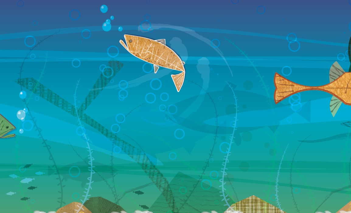
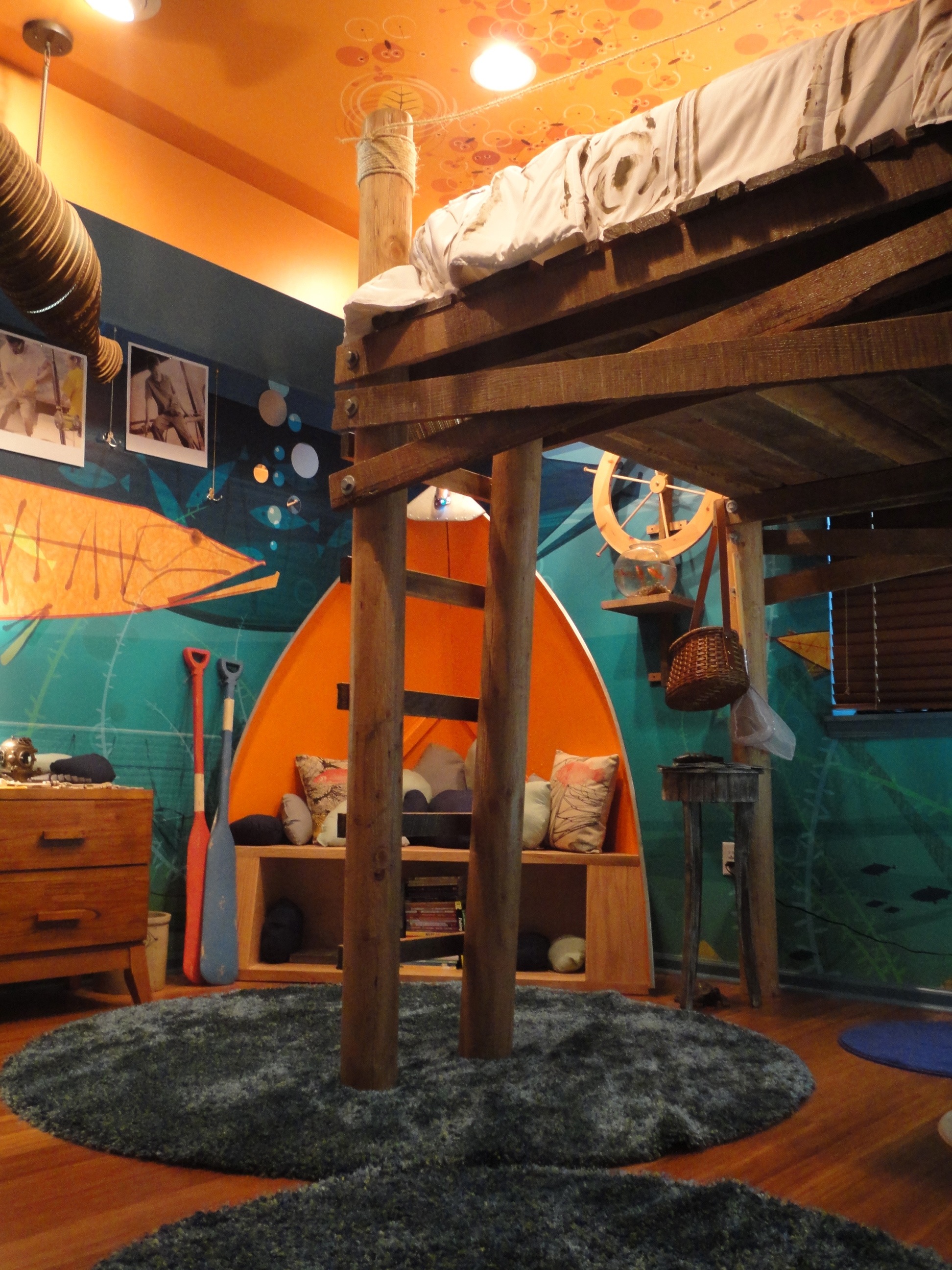
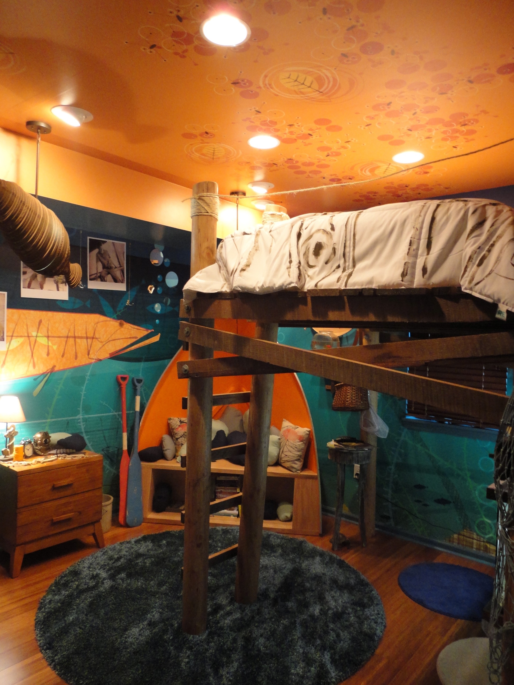
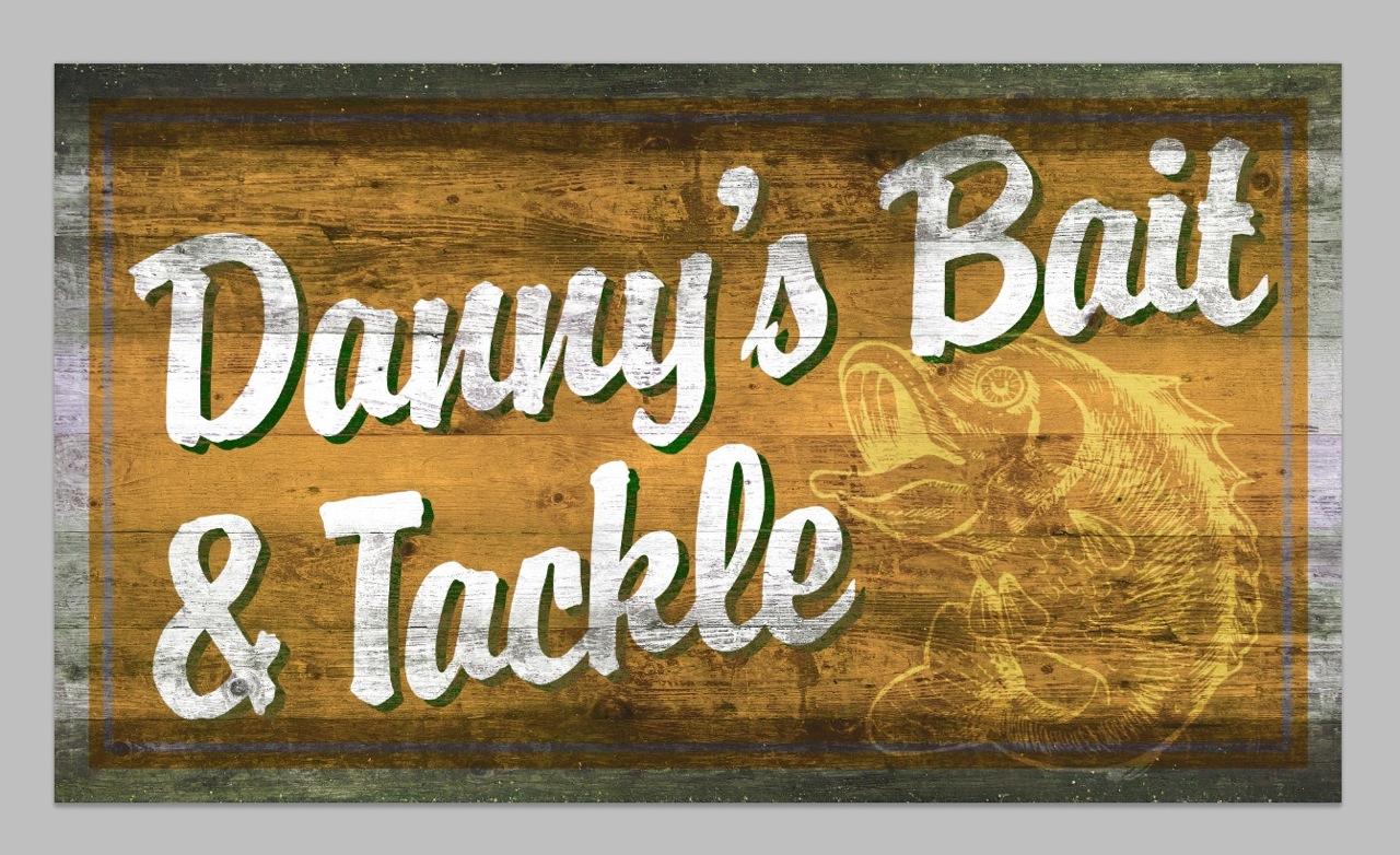
I received a call from Architect, Christian Prasch (representing ABC) on Friday September 30, 2011 at 4:00 pm. We discussed the Gibbs family home project in depth. Christian was one of many designers on the project and our mutual task was the design of youngest Gibbs son Danny’s bedroom. I was to design a mural extending across all four bedroom walls and the ceiling, while Christian took care of the dimensional items and room propping. The Deadline was a killer—Sunday, October 2 at 5:00 pm.

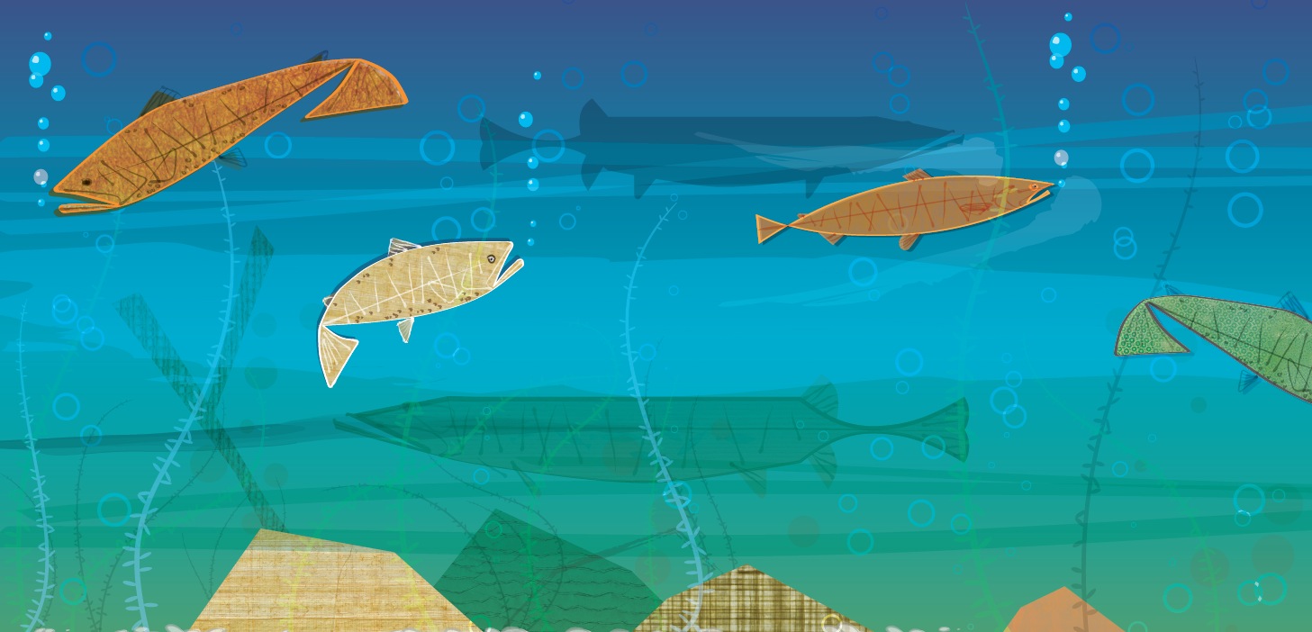
Danny Gibbs is a typical Iowa boy—interested in the outdoors—specifically fishing. The bedroom was designed with his interests in mind. The bedroom floor was the river bottom, the bed frame a rustic dock, with the walls an underwater mural.

extreme-makeover

Mural-1

Mural-2

Mural-3

Gone Fishin’ Sign

DSC00166

DSC00157

Dannys_Bait_and_Tackle

Living in Iowa, it’s pretty easy to feel a galaxy away from the every day “goings on” of Hollywood. I have no idea what Joan and Melissa Rivers are doing this morning—nor do my Hollywood friends know that there is a deer in my backyard as I write this.

So, when Hollywood comes to Iowa, it’s kind of a big deal. Extreme Makeover Home Edition is working on a build just north of Cedar Rapids in a small town called West Union. Us hard-working, salt-of-the-earth Iowans are excited about changing the living conditions for the Gibb’s family. Doing good is always a good thing.


I have been working with Extreme Makeover Home Edition Producers and Designers, and have been given the task of creating artwork for various parts of the new home.

I can’t disclose too much about our role just yet….more on that to come. But, we’re excited to be involved on the project, and very happy to help this wonderful family.

Rock Z on HD3

A lot has changed in radio over the last few years. Z has been a pioneer since the station’s conception. HD Radio is one such example. I won’t attempt to explain HD radio here. I would look like a poser and the true audio geeks would rain down on my misuse of all the esoterica. From an end user perspective, HD radio is pretty cool. A frequency, such as 102.9 (through the miracles of modern science) can be split into a number of multicast channels.

Early on, as Z experimented with how to split the frequency into several multicasts, Basler Design Group was, at the same time, experimenting with how to “split” the Z identity into three sub brands. This seems easy on the surface, but it is actually quite challenging. The mother brand Z102.9 had legs, with great awareness. And this awareness was directly tied back to a station format (Contemporary Hit Radio), which in turn attracted a specific listener. Now, under the new HD multicast structure, Z102.9, the Contemporary Hit Radio (CHR) format is now 102.9 HD1. 102.9 HD2 could be an entirely different format, such as Classic Rock, and attract an entirely different listener. And, likewise, 102.9 HD3 could be a third format with a third listening demographic.

Whew. This is a real challenge. The examples below were experiments in this brand extension exercise. To date, these have not been used, but they are pretty interesting given this branding puzzle.


Hit Z on HD1

Club Z on HD2

Club Z on HD2

Rock Z on HD3

Z102.9 Media Kit

Our relationship with Rob Norton at Z102.9 goes back some 18 years. “But Z102.9 has only been on the air for 12 years,” you say? Well, this is true. Rob’s relationship with Basler Design Group goes back to about 1992, when he, and partner Eliot Keller, owned another iconic Rock radio station, KRNA, based in Iowa City, Iowa. We collaborated on many projects for KRNA, as well as Q103, the predecessor to Z102.9.

This is an overview brochure that Z102.9 advertising sales staff would use to promote the station to potential advertisers. This piece was designed to have the simplicity of a flip-chart—simple compelling statements, presented with memorable imagery.

Z102.9 Media Kit Spread
Go ahead. Click on it. There’s so much more to see.

For all of you graphic design history buffs out there, this piece was executed with Quark Xpress 3.3, Photoshop 3.0 aka Big Electric Cat. It seems like a lifetime ago, but, conceptually, this piece has stood the test of time very well.

Amana Heating & Cooling Shipping Carton

From about 1991 to 2002, Basler Design Group had the pleasure working with several great people at Amana Refrigeration. We did some great work, moved the brand ahead, and had a lot of fun in the process. One such character was Dennis McNeil. Dennis was a new hire in the Heating & Cooling area. As the son of a HVAC man, I guess his career path was defined in his genes.

I still remember those days very well. Our work was refreshing, especially given the somewhat industrial nature of the niche. A problem with most Heating & Cooling contractors is that few have a showroom. After all, why would you? Air conditioners and furnaces are heavy, and not all that interesting to look at.

After a bit of thinking it dawned on us, that a furnace/air conditioner shipping carton was a missed branding opportunity. Hey, the cartons have to be present. And they’re darn big. It seemed like a waste to not put a little ink on them and make them work a bit harder. Of course, all of the accountants were cringing at adding any cost to the printing of cartons, so we designed the artwork to be implemented in one color—black.

Hauled to residential neighborhoods in the back of pickup trucks, the brown kraft cartons were immediately recognizable, and added little cost to the bottom line. Score one for commando marketing.

Amana Heating & Cooling

Upjohn Implus

A long, long time ago, the word implant conjured up a much different mental picture (especially to a commercial feedlot owner) than it does today. Basler Design Group was hired by Biggs Gilmore and Upjohn Animal Health to create product launch and sales support materials for Implus. Basler Design Group created unique designs for Implus, walking a fine line between traditional and contemporary.

Implus-Lariat-Box

Hand tooled leather patterns were a key component in the new look. Patterns were made by doing tracing paper and pastel rubbings of actual tooled leather saddles. The rubbings were then scanned on a flatbed, and driven home through liberal dose of Photoshop processes. The typography is Garamond. Headlines were typeset and laser printed at 25% size. Printouts were crumpled, kicked, scraped, sanded, and taunted. The haggard printouts were then scanned back in and used as final artwork for the distressed type. The photo of the “bunk rider” is one of thousands of images we shot during a 4-day-long photo shoot at a large commercial feedlot in Yuma, Arizona.

Basler Design Group’s Implus product introduction materials went on to sweep the National Agri-Marketers Association, Best of NAMA, National Awards. Virtually every piece in the series won its respective category, with the entire campaign winning National NAMA Best of Show.