Angels With Dirty Faces Title

I am a typography nut—especially interested in type history. Our studio has a collection of old graphic arts books from the 1900s through 1950s that we use for inspiration from time to time. As well, I have always been interested in the typography of old movie title and end stills. They are a typographic feast.

OK, some of you won’t get it, but I know this will be of interest to my designer friends, and a few fans of old film as well. Just click on the title still below. You’re in for a treat.

Our involvement with quarterly magazine, The Brass Bell, caught the attention of a Boca Raton, Florida-based client interested in establishing an upscale lifestyle magazine for the Lake Geneva, Wisconsin area. This was a great opportunity—the chance to establish a vertical, niche publication for a legendary tourist destination.

For those not familiar with Lake Geneva, this small community on a lake is nestled just north of Chicago, and just west of Milwaukee in southeastern Wisconsin. The area has more interesting history than any small Wisconsin town should have—the playground of the Schwinn’s, the Maytag’s, the Wrigley’s, and yes, Guns ‘N Roses lead singer Axl Rose. Hugh Heffner even established one of his legendary Playboy Clubs in Lake Geneva.

The first issue of G is the result of many hours of interviews, sweat, and mental gymnastics. It’s not the easiest task assembling a magazine from vapor, but given G’s overwhelming debut, I think we hit the mark.

G Magazine Masthead Script

Z102.9 Media Kit

Our relationship with Rob Norton at Z102.9 goes back some 18 years. “But Z102.9 has only been on the air for 12 years,” you say? Well, this is true. Rob’s relationship with Basler Design Group goes back to about 1992, when he, and partner Eliot Keller, owned another iconic Rock radio station, KRNA, based in Iowa City, Iowa. We collaborated on many projects for KRNA, as well as Q103, the predecessor to Z102.9.

This is an overview brochure that Z102.9 advertising sales staff would use to promote the station to potential advertisers. This piece was designed to have the simplicity of a flip-chart—simple compelling statements, presented with memorable imagery.

Z102.9 Media Kit Spread
Go ahead. Click on it. There’s so much more to see.

For all of you graphic design history buffs out there, this piece was executed with Quark Xpress 3.3, Photoshop 3.0 aka Big Electric Cat. It seems like a lifetime ago, but, conceptually, this piece has stood the test of time very well.

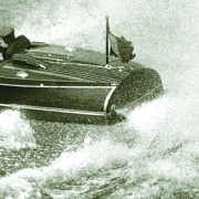
I love boating. It is a lifelong passion having spent many summers on northern Lake Michigan. I am slowly turning this passion for boating and the marine industry into business and have had the pleasure of working with Chris-Craft, a Sarasota, boat builder—one of the oldest and most prestigious names in pleasure boating. This collaboration has lead to more marine client relationships, such as the Minnesota Lakes Maritime Museum, Nelson Boatworks, and Van Ness Engineering.

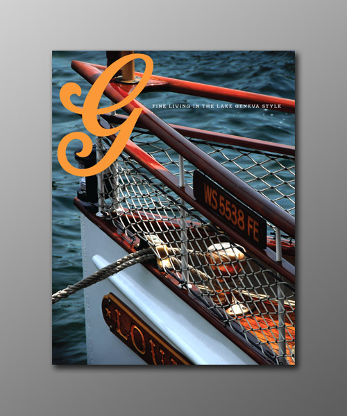
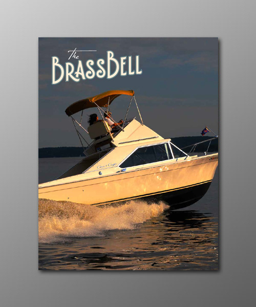
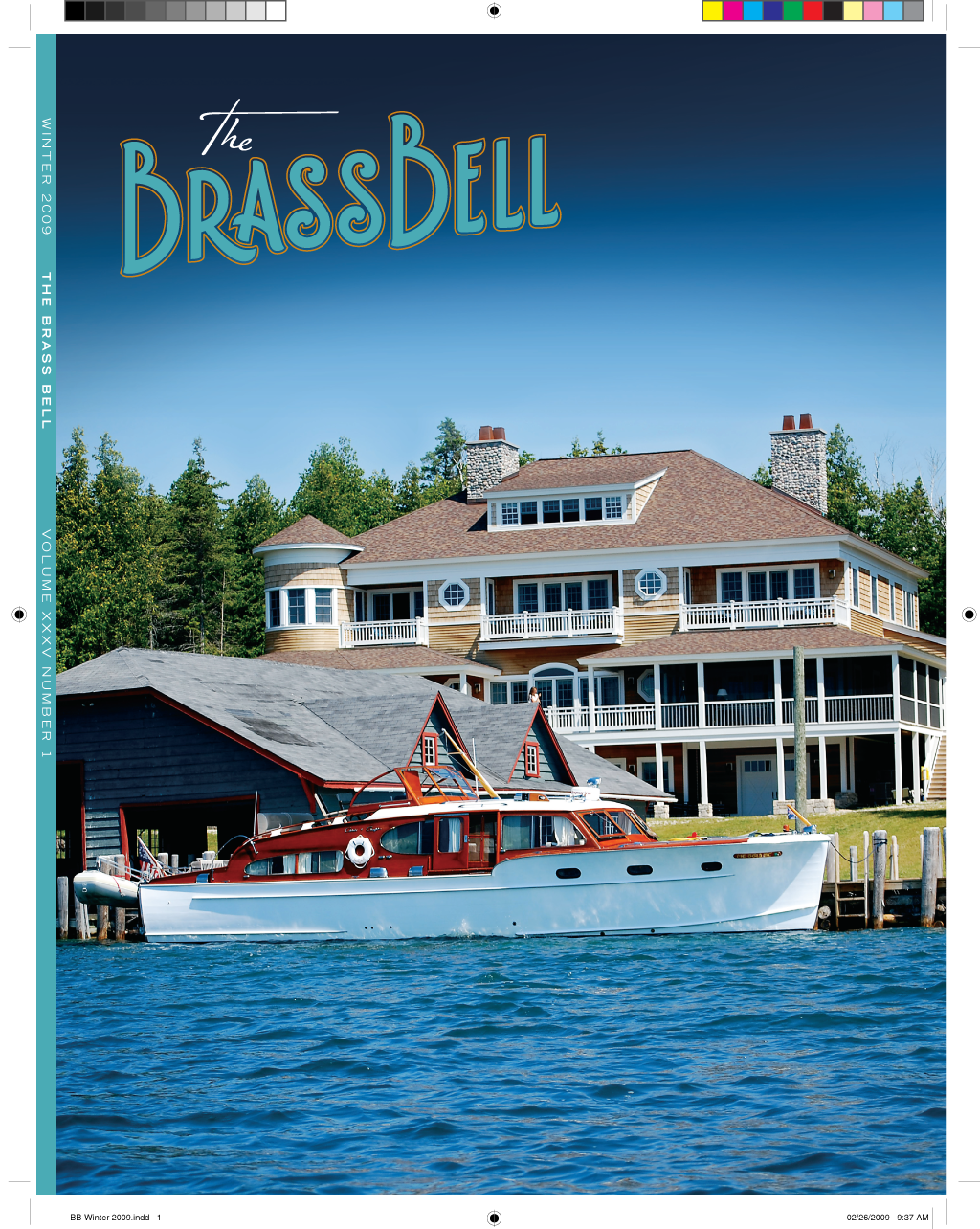
The Brass Bell, is an upscale, niche quarterly, targeted at antique and classic boating enthusiasts. In just a couple of years we have taken this publication from a commodity-grade 32-page newsletter to a 96-page work of art.

Brass Bell Fall 2010

The Brass Bell is printed on recycled stock, using soy-based inks and minimal aqueous coating. The issues are perfect bound, and are mailed to all 50 U.S. states, and over 30 countries worldwide.

The Brass Bell has a decidedly vintage look, courtesy of custom-drawn typefonts, dingbats, borders and patterns. Masthead typography features handcrafted letterforms based on actual deco typography samples.

BB-Winter-2009-Cover

The Brass Bell is a perfect example of electronic design workflow. There is no wasted paper or toner printing process used on the design of the issues. Workflow is PDF based—low res PDFs for commenting and approvals, high res PDFs for final output. The magazine is typically preflighted, ripped, soft-proofed, approved, and on press within 24 hours of forwarding artwork to the printer.

Designing a high-end niche quarterly can be a grind at times, but it is very gratifying to see design play a key role in actually advancing the niche.

You’ll see a lot more of The Brass Bell in days ahead.