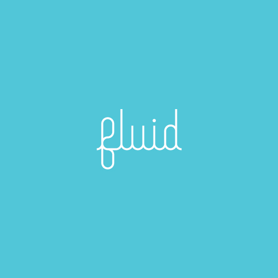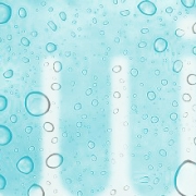
What a great name. We have been called on to develop an identity based on this one, simple word. We can’t exactly disclose the who, what, where of this project just yet. Rest assured, we will reveal the details of this company very soon. Until then, here is a first look at fluid.
Fluid has a positive vibe. Free-flowing. Continuous. Without beginning or end. Without boundaries. Our solution is a handcrafted script for the fluid word mark. To keep the graphic simple, we constrained our solution to a couple of rules:
- One single line…as though it was drawn without lifting pen from paper.
- One line weight.
We’re pleased with the result. It looks right. And perhaps more important, it feels right.