Tag Archive for: identity

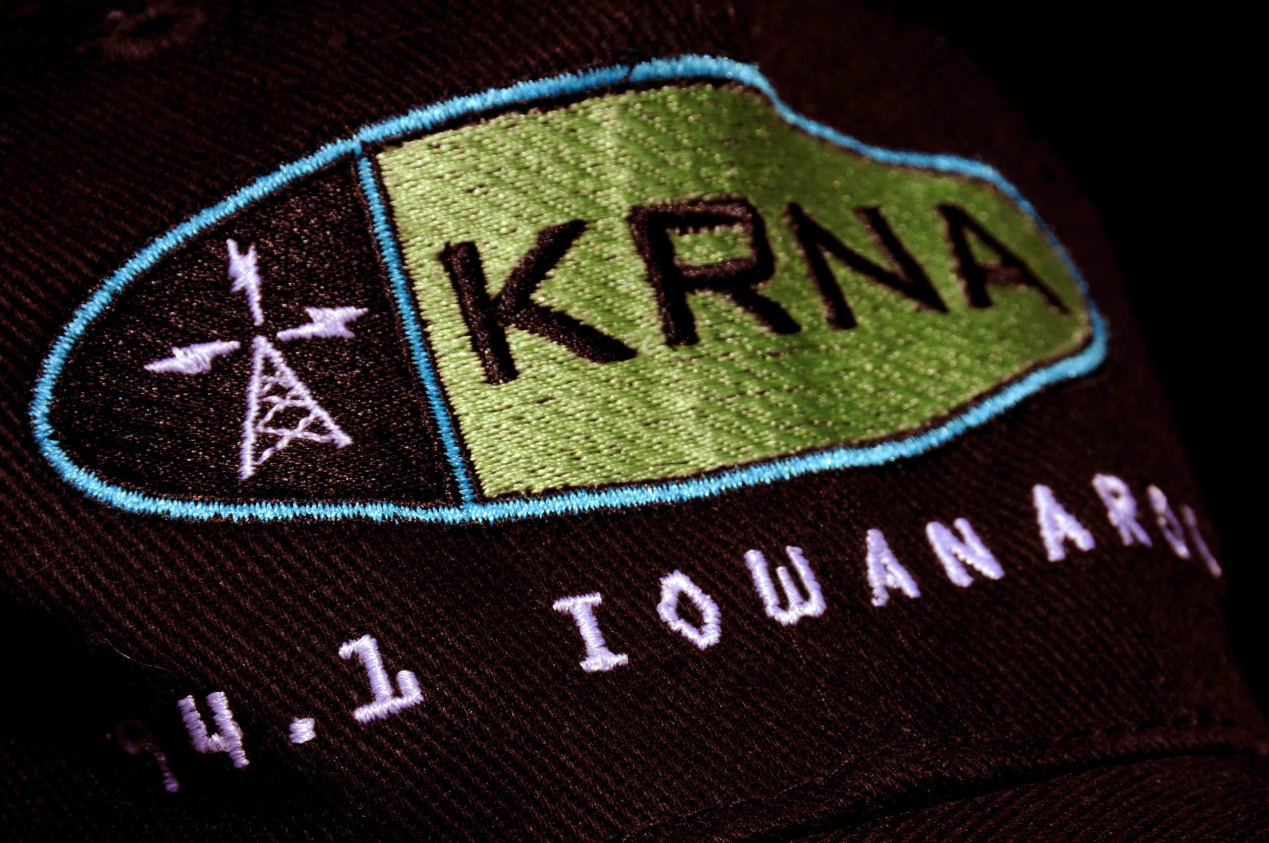
KRNA 94.1 Iowanarock

A number of years ago we designed everything for legendary classic rock station 94.1 KRNA. Founded by a couple of University of Iowa students, Rob Norton and Eliot Keller, KRNA grew from grassroots-to-powerhouse.

Rob and Eliot sold off their lifelong project in 1998. Prior to them doing so, we kicked off a new look for KRNA, with a new logo and positioning line. In a sea of tired rock station taglines, we wanted to create something fresh, maybe even a bit odd and definitely regional.

The result? KRNA. 94.1 IOWANAROCK.
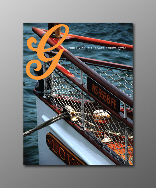
Our involvement with quarterly magazine, The Brass Bell, caught the attention of a Boca Raton, Florida-based client interested in establishing an upscale lifestyle magazine for the Lake Geneva, Wisconsin area. This was a great opportunity—the chance to establish a vertical, niche publication for a legendary tourist destination.

For those not familiar with Lake Geneva, this small community on a lake is nestled just north of Chicago, and just west of Milwaukee in southeastern Wisconsin. The area has more interesting history than any small Wisconsin town should have—the playground of the Schwinn’s, the Maytag’s, the Wrigley’s, and yes, Guns ‘N Roses lead singer Axl Rose. Hugh Heffner even established one of his legendary Playboy Clubs in Lake Geneva.

The first issue of G is the result of many hours of interviews, sweat, and mental gymnastics. It’s not the easiest task assembling a magazine from vapor, but given G’s overwhelming debut, I think we hit the mark.

G Magazine Masthead Script

Van Ness Engineering

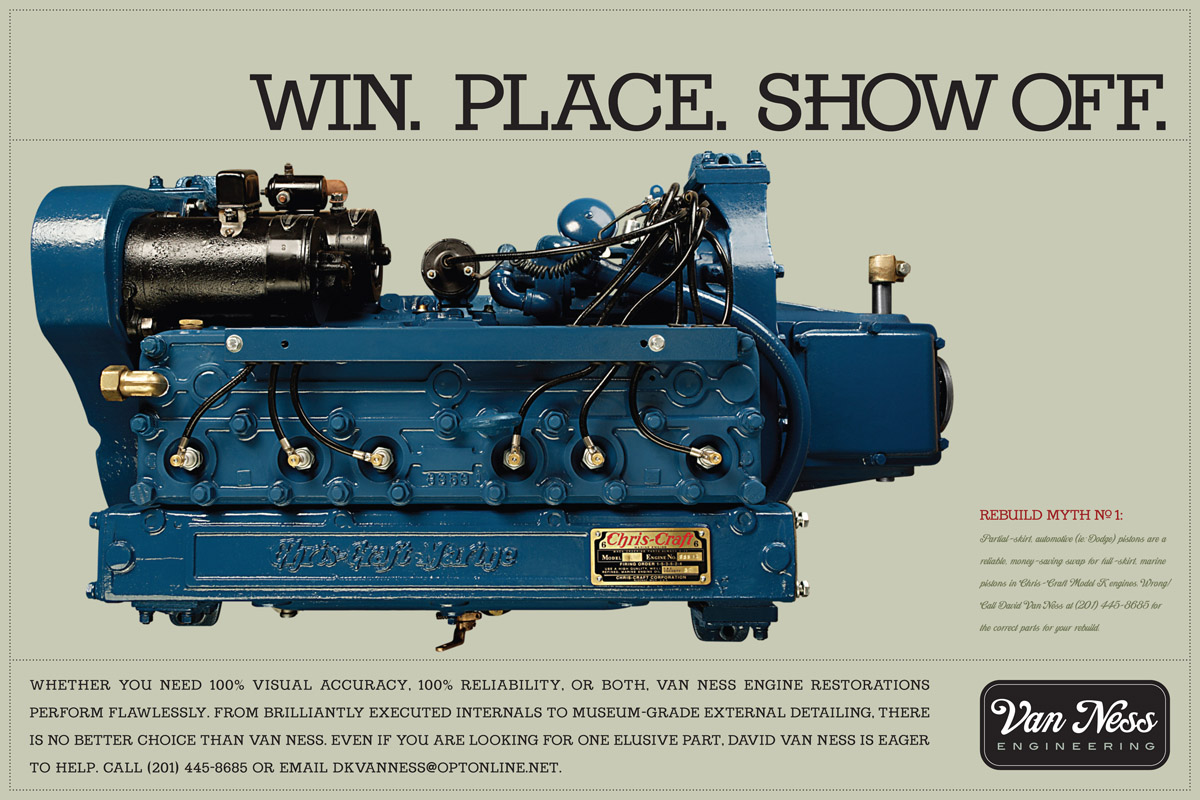
I have known David Van Ness of Van Ness Engineering for many years now. He is very well-known in the antique boat niche, and has a reputation for being among the best engine restorers in the business. David has worked on a few projects for me, and I have worked on a few things for him. Recently we were asked to take a new look at his advertising and marketing communications with the goal of creating a presence given today’s dynamics within this small niche.

Here is a look at the first creative in this ad new series. The concept focuses on several types of enthusiasts:

  • Those interested in totally rebuilt internals with museum-grade external restoration for Concours-level competition.
  • Those interested in a partial rebuild with good (but not necessarily Concours-level) exterior cosmetics.
  • And those interested in building an ultra-reliable vintage motor, with little regard to exterior detailing.

This is a very straightforward concept executed in a very clean style. There are several other ads in the series that we will show soon.

Van Ness Engineering Ad

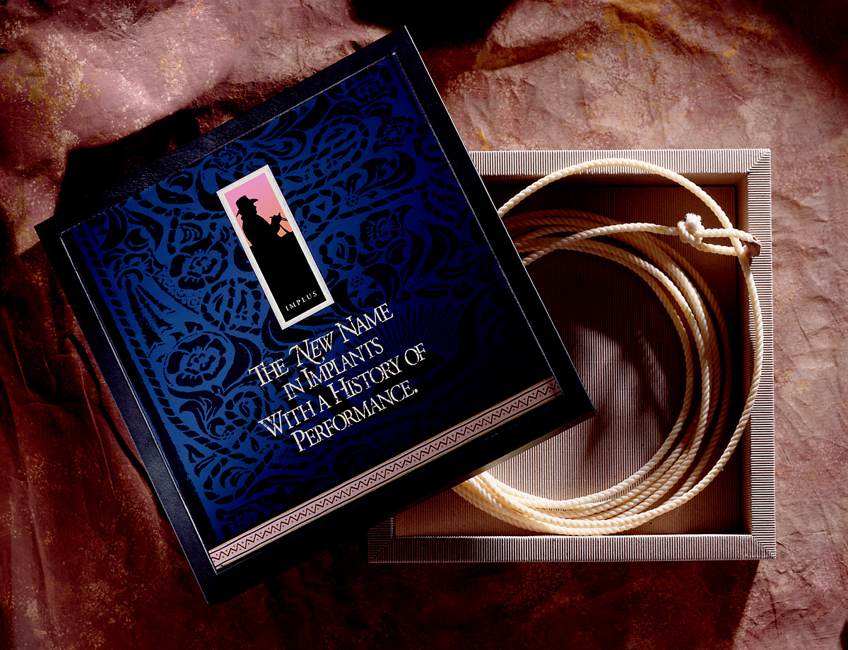
Upjohn Implus

A long, long time ago, the word implant conjured up a much different mental picture (especially to a commercial feedlot owner) than it does today. Basler Design Group was hired by Biggs Gilmore and Upjohn Animal Health to create product launch and sales support materials for Implus. Basler Design Group created unique designs for Implus, walking a fine line between traditional and contemporary.

Implus-Lariat-Box

Hand tooled leather patterns were a key component in the new look. Patterns were made by doing tracing paper and pastel rubbings of actual tooled leather saddles. The rubbings were then scanned on a flatbed, and driven home through liberal dose of Photoshop processes. The typography is Garamond. Headlines were typeset and laser printed at 25% size. Printouts were crumpled, kicked, scraped, sanded, and taunted. The haggard printouts were then scanned back in and used as final artwork for the distressed type. The photo of the “bunk rider” is one of thousands of images we shot during a 4-day-long photo shoot at a large commercial feedlot in Yuma, Arizona.

Basler Design Group’s Implus product introduction materials went on to sweep the National Agri-Marketers Association, Best of NAMA, National Awards. Virtually every piece in the series won its respective category, with the entire campaign winning National NAMA Best of Show.