One from the bottom drawer
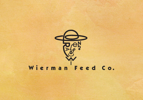
With 20 years of work to draw on, I’m posting a personal favorite. This logotype, circa 1991 or 1992, was developed for a friend of mine who owned a very small town Feed Store. While this mark made some of the small town conservatives scratch their heads, it was a favorite of Communication Arts judges, being juried into their prestigious Design Annual.
“Wierman,” was translated visually to a “Wire Man,” with the face comprised of W-i-e-r-m-a-n letterforms.


