Upjohn Implus

A long, long time ago, the word implant conjured up a much different mental picture (especially to a commercial feedlot owner) than it does today. Basler Design Group was hired by Biggs Gilmore and Upjohn Animal Health to create product launch and sales support materials for Implus. Basler Design Group created unique designs for Implus, walking a fine line between traditional and contemporary.
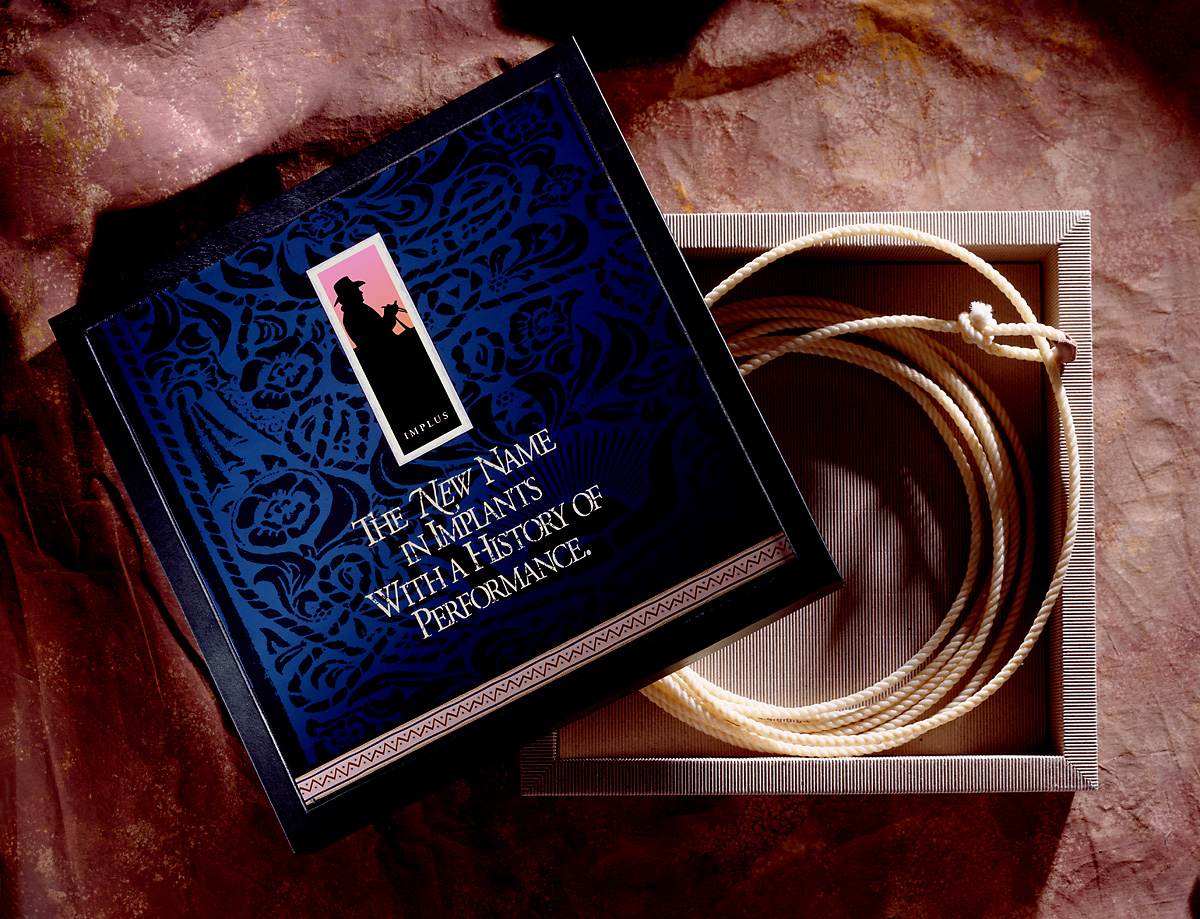
Implus-Lariat-Box

Hand tooled leather patterns were a key component in the new look. Patterns were made by doing tracing paper and pastel rubbings of actual tooled leather saddles. The rubbings were then scanned on a flatbed, and driven home through liberal dose of Photoshop processes. The typography is Garamond. Headlines were typeset and laser printed at 25% size. Printouts were crumpled, kicked, scraped, sanded, and taunted. The haggard printouts were then scanned back in and used as final artwork for the distressed type. The photo of the “bunk rider” is one of thousands of images we shot during a 4-day-long photo shoot at a large commercial feedlot in Yuma, Arizona.

Basler Design Group’s Implus product introduction materials went on to sweep the National Agri-Marketers Association, Best of NAMA, National Awards. Virtually every piece in the series won its respective category, with the entire campaign winning National NAMA Best of Show.
Nelson Boatworks

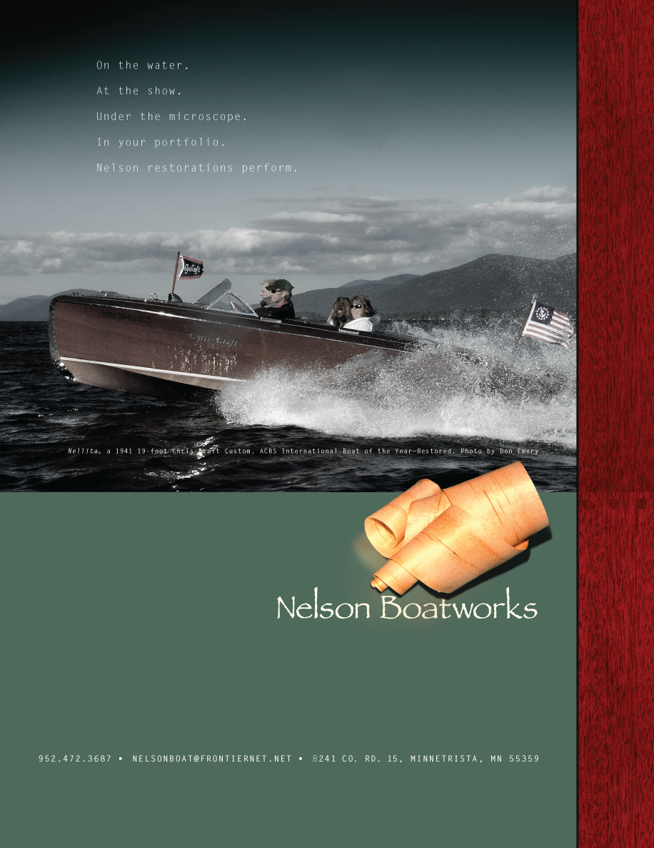
In the prior post, I mentioned a client of ours, Nelson Boatworks. Dan Nelson is a boat builder and restorer in northern Minnesota who has a reputation for creating concours-winnning, museum-grade boat restorations.

This ad has a very quiet look about it. But the message is strong, and strategically on target.

Nelson-Boatworks-Righthand-4c-1p

I love boating. It is a lifelong passion having spent many summers on northern Lake Michigan. I am slowly turning this passion for boating and the marine industry into business and have had the pleasure of working with Chris-Craft, a Sarasota, boat builder—one of the oldest and most prestigious names in pleasure boating. This collaboration has lead to more marine client relationships, such as the Minnesota Lakes Maritime Museum, Nelson Boatworks, and Van Ness Engineering.

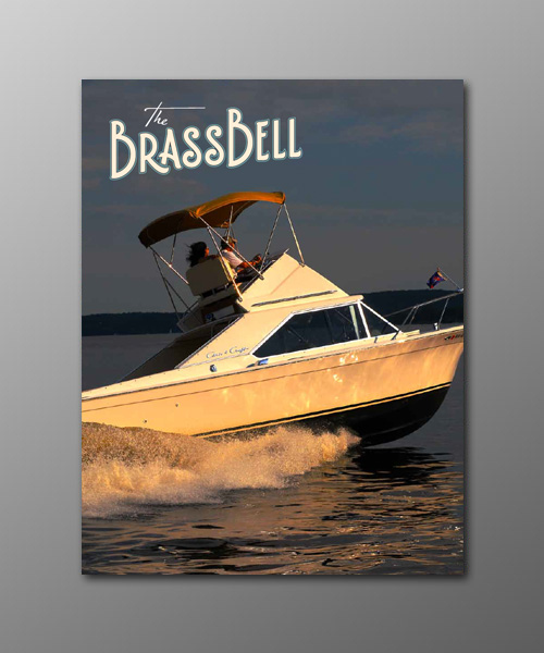
The Brass Bell, is an upscale, niche quarterly, targeted at antique and classic boating enthusiasts. In just a couple of years we have taken this publication from a commodity-grade 32-page newsletter to a 96-page work of art.

Brass Bell Fall 2010

The Brass Bell is printed on recycled stock, using soy-based inks and minimal aqueous coating. The issues are perfect bound, and are mailed to all 50 U.S. states, and over 30 countries worldwide.

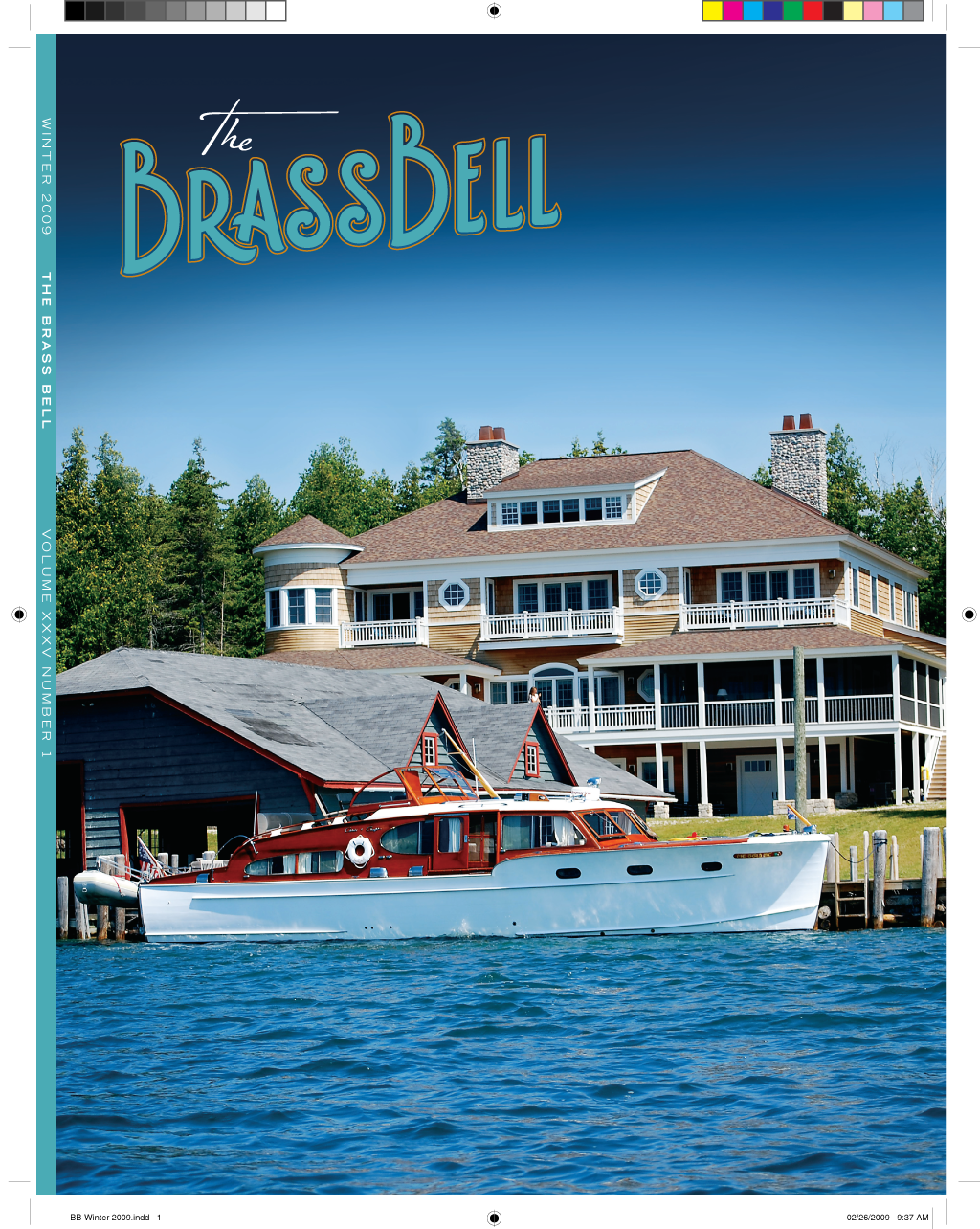
The Brass Bell has a decidedly vintage look, courtesy of custom-drawn typefonts, dingbats, borders and patterns. Masthead typography features handcrafted letterforms based on actual deco typography samples.

BB-Winter-2009-Cover

The Brass Bell is a perfect example of electronic design workflow. There is no wasted paper or toner printing process used on the design of the issues. Workflow is PDF based—low res PDFs for commenting and approvals, high res PDFs for final output. The magazine is typically preflighted, ripped, soft-proofed, approved, and on press within 24 hours of forwarding artwork to the printer.

Designing a high-end niche quarterly can be a grind at times, but it is very gratifying to see design play a key role in actually advancing the niche.

You’ll see a lot more of The Brass Bell in days ahead.