Amana Heating & Cooling Shipping Carton

From about 1991 to 2002, Basler Design Group had the pleasure working with several great people at Amana Refrigeration. We did some great work, moved the brand ahead, and had a lot of fun in the process. One such character was Dennis McNeil. Dennis was a new hire in the Heating & Cooling area. As the son of a HVAC man, I guess his career path was defined in his genes.

I still remember those days very well. Our work was refreshing, especially given the somewhat industrial nature of the niche. A problem with most Heating & Cooling contractors is that few have a showroom. After all, why would you? Air conditioners and furnaces are heavy, and not all that interesting to look at.

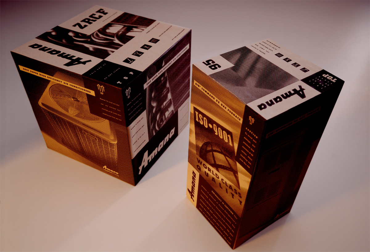
After a bit of thinking it dawned on us, that a furnace/air conditioner shipping carton was a missed branding opportunity. Hey, the cartons have to be present. And they’re darn big. It seemed like a waste to not put a little ink on them and make them work a bit harder. Of course, all of the accountants were cringing at adding any cost to the printing of cartons, so we designed the artwork to be implemented in one color—black.

Hauled to residential neighborhoods in the back of pickup trucks, the brown kraft cartons were immediately recognizable, and added little cost to the bottom line. Score one for commando marketing.

Amana Heating & Cooling

Midwestern University

Midwestern University

Basler Design Group, in partnership with our colleagues at Click New Media Group, recently completed a Website redesign for Downers Grove, Illinois based Midwestern University. The Website refresh was handled in tandem with the deployment of a content management system from Seattle-based Ingeniux. The challenges with doing a university-wide Website update are numerous, with many opportunities to stumble. We are pleased to say that the project deployed on time and on budget, with no surprises on launch day.

Midwestern University Website

Upjohn Implus

A long, long time ago, the word implant conjured up a much different mental picture (especially to a commercial feedlot owner) than it does today. Basler Design Group was hired by Biggs Gilmore and Upjohn Animal Health to create product launch and sales support materials for Implus. Basler Design Group created unique designs for Implus, walking a fine line between traditional and contemporary.

Implus-Lariat-Box

Hand tooled leather patterns were a key component in the new look. Patterns were made by doing tracing paper and pastel rubbings of actual tooled leather saddles. The rubbings were then scanned on a flatbed, and driven home through liberal dose of Photoshop processes. The typography is Garamond. Headlines were typeset and laser printed at 25% size. Printouts were crumpled, kicked, scraped, sanded, and taunted. The haggard printouts were then scanned back in and used as final artwork for the distressed type. The photo of the “bunk rider” is one of thousands of images we shot during a 4-day-long photo shoot at a large commercial feedlot in Yuma, Arizona.

Basler Design Group’s Implus product introduction materials went on to sweep the National Agri-Marketers Association, Best of NAMA, National Awards. Virtually every piece in the series won its respective category, with the entire campaign winning National NAMA Best of Show.

Nelson Boatworks

In the prior post, I mentioned a client of ours, Nelson Boatworks. Dan Nelson is a boat builder and restorer in northern Minnesota who has a reputation for creating concours-winnning, museum-grade boat restorations.

This ad has a very quiet look about it. But the message is strong, and strategically on target.

Nelson-Boatworks-Righthand-4c-1p

I love boating. It is a lifelong passion having spent many summers on northern Lake Michigan. I am slowly turning this passion for boating and the marine industry into business and have had the pleasure of working with Chris-Craft, a Sarasota, boat builder—one of the oldest and most prestigious names in pleasure boating. This collaboration has lead to more marine client relationships, such as the Minnesota Lakes Maritime Museum, Nelson Boatworks, and Van Ness Engineering.

The Brass Bell, is an upscale, niche quarterly, targeted at antique and classic boating enthusiasts. In just a couple of years we have taken this publication from a commodity-grade 32-page newsletter to a 96-page work of art.

Brass Bell Fall 2010

The Brass Bell is printed on recycled stock, using soy-based inks and minimal aqueous coating. The issues are perfect bound, and are mailed to all 50 U.S. states, and over 30 countries worldwide.

The Brass Bell has a decidedly vintage look, courtesy of custom-drawn typefonts, dingbats, borders and patterns. Masthead typography features handcrafted letterforms based on actual deco typography samples.

BB-Winter-2009-Cover

The Brass Bell is a perfect example of electronic design workflow. There is no wasted paper or toner printing process used on the design of the issues. Workflow is PDF based—low res PDFs for commenting and approvals, high res PDFs for final output. The magazine is typically preflighted, ripped, soft-proofed, approved, and on press within 24 hours of forwarding artwork to the printer.

Designing a high-end niche quarterly can be a grind at times, but it is very gratifying to see design play a key role in actually advancing the niche.

You’ll see a lot more of The Brass Bell in days ahead.

About a week ago, I was asked to teach an undergraduate, advanced graphic design class, at nearby Mount Mercy University. I have never formally taught anyone anything. But, I do enjoy teaching. It seems like a natural extension of what I do as a communicator. I have one full class period under my belt. Nobody told me to leave—good start, I guess.

Today, we had our first snow day, resulting in a late 10:00 am start to a class that ends at 10:20. As winter continues to create challenges, it is also a great time to shoot a few images.

DSC_7554

DSC_7553

I am no meteorologist, otherwise I would have a scientific reason why we got hairy ice a couple of weeks ago. It is certainly one of the more bizarre works of nature this season.

The shots below are interesting to me. I like the low depth of field and the intense highlights on the ice.

Ice

Ice-1

New Day

February 8, 2010—a day to remember.

First, our official entry into the web universe. Now, three posts later, we’re building confidence. We have a lot to say. Hang with us while we sort it all out. For now, here’s where you can find us.

basler_letterhead

Basler Design Group is a visual design and marketing resource based in Cedar Rapids, Iowa. We’re a technically savvy design studio, founded in 1990. In fact our roots go back long before that.

Iowa-Map

We got our start in this business long before computers. Remember 1983? There was no raster data. Just a darn fine roll of C-41, or a rich, silvery Portriga print. There were no vector paths—just amberlith, a blade, and good handskills. It was true in 1983 and it’s true today—ideas and results are what make us tick.

We have taken our share of lumps since…oh, about 1993…given our minimalist presence on the web. Well, I am happy to say, 2010 brings new hope. Basler Design Group will embrace the web, just like we have for our other clients.

In our own defense, we are quite good at this web thing. We have done some pretty amazing things for many of our clients—just not for ourselves. Oops, I am making excuses again.

The Cobbler’s Children Always Go Barefoot.